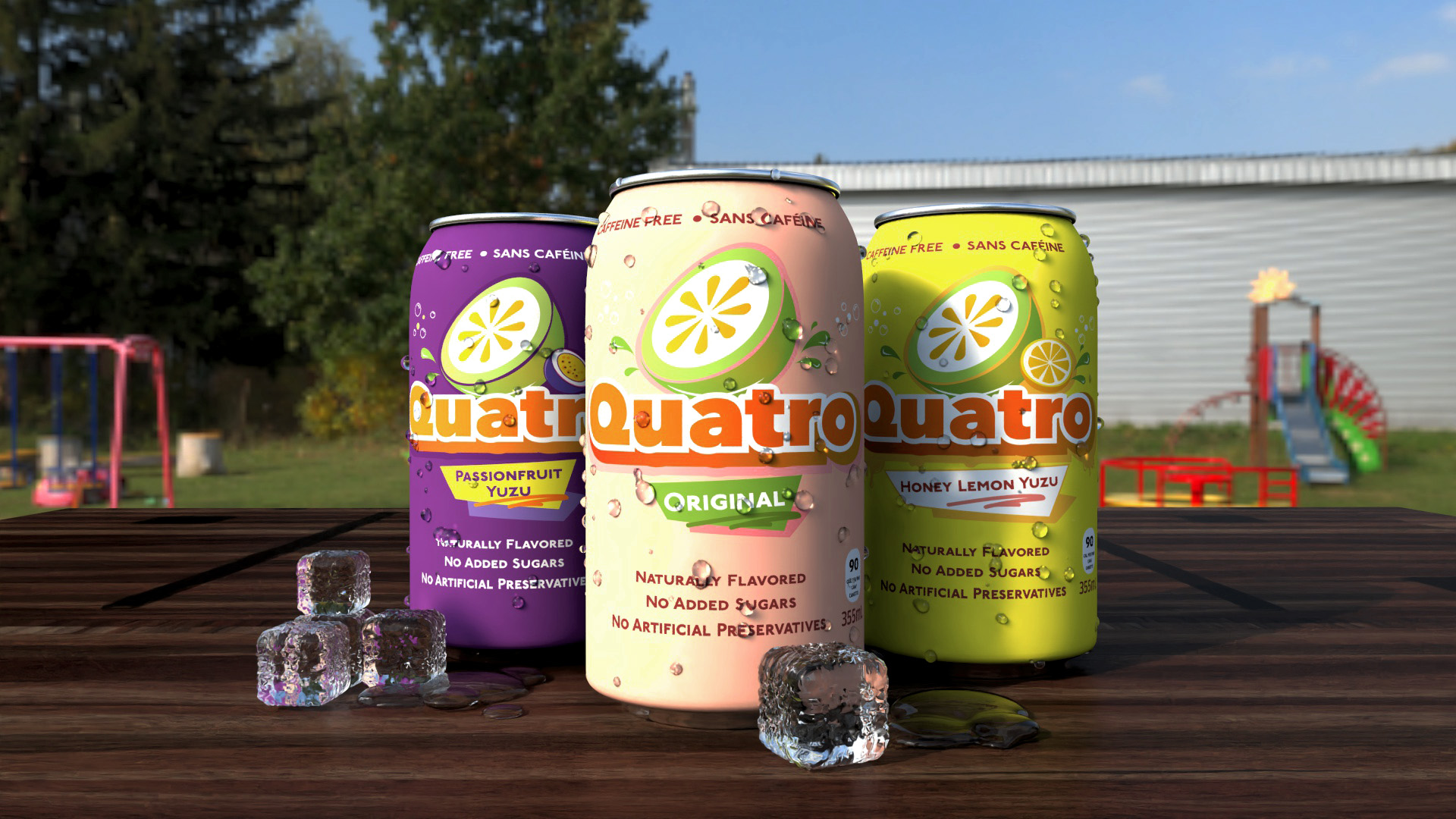
Quatro 80s Beverage Rebranding
Overview
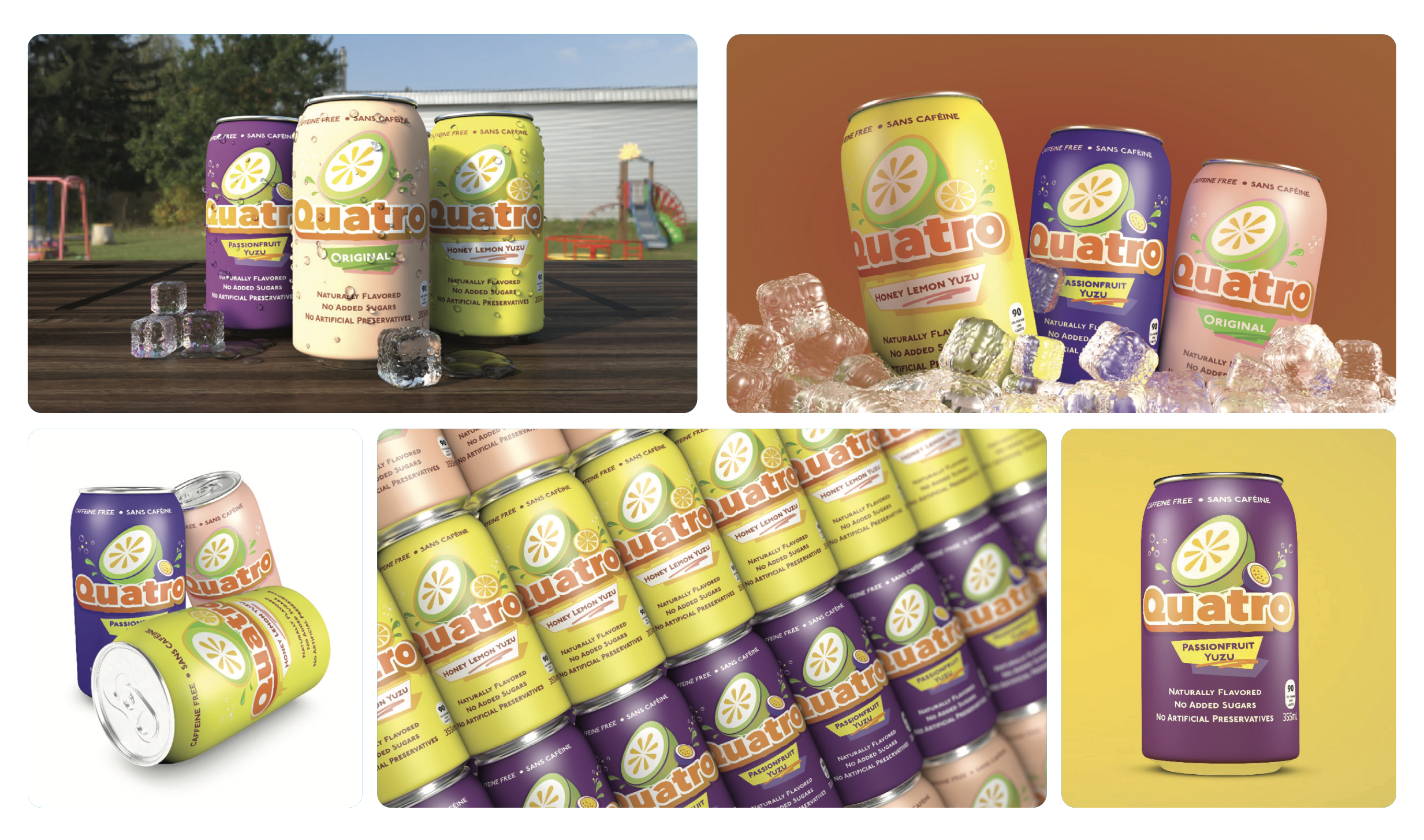
A full brand identity redesign of "Quatro," a classic Latin American soft drink, repositioned for a bold 80s-retro aesthetic targeting a younger, trend-aware market. The project covers logo, typography, colour palette, and outdoor advertising applications.
The Challenges
The original Quatro brand identity felt visually dated and lacked consistency across formats. The challenge was to modernize it while honouring its heritage — and making it competitive on outdoor advertising placements.
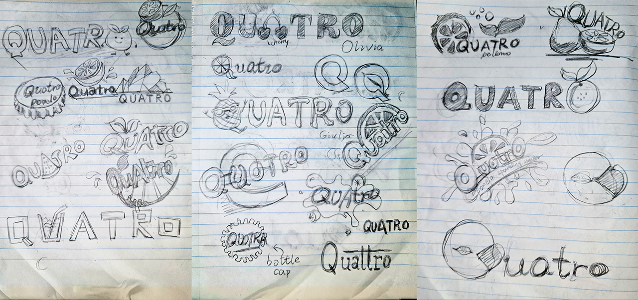
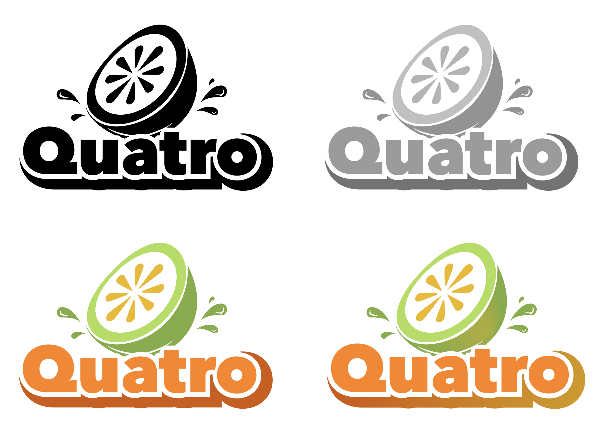
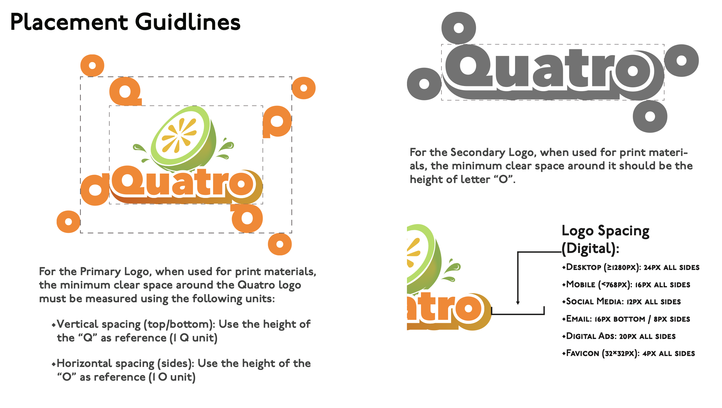
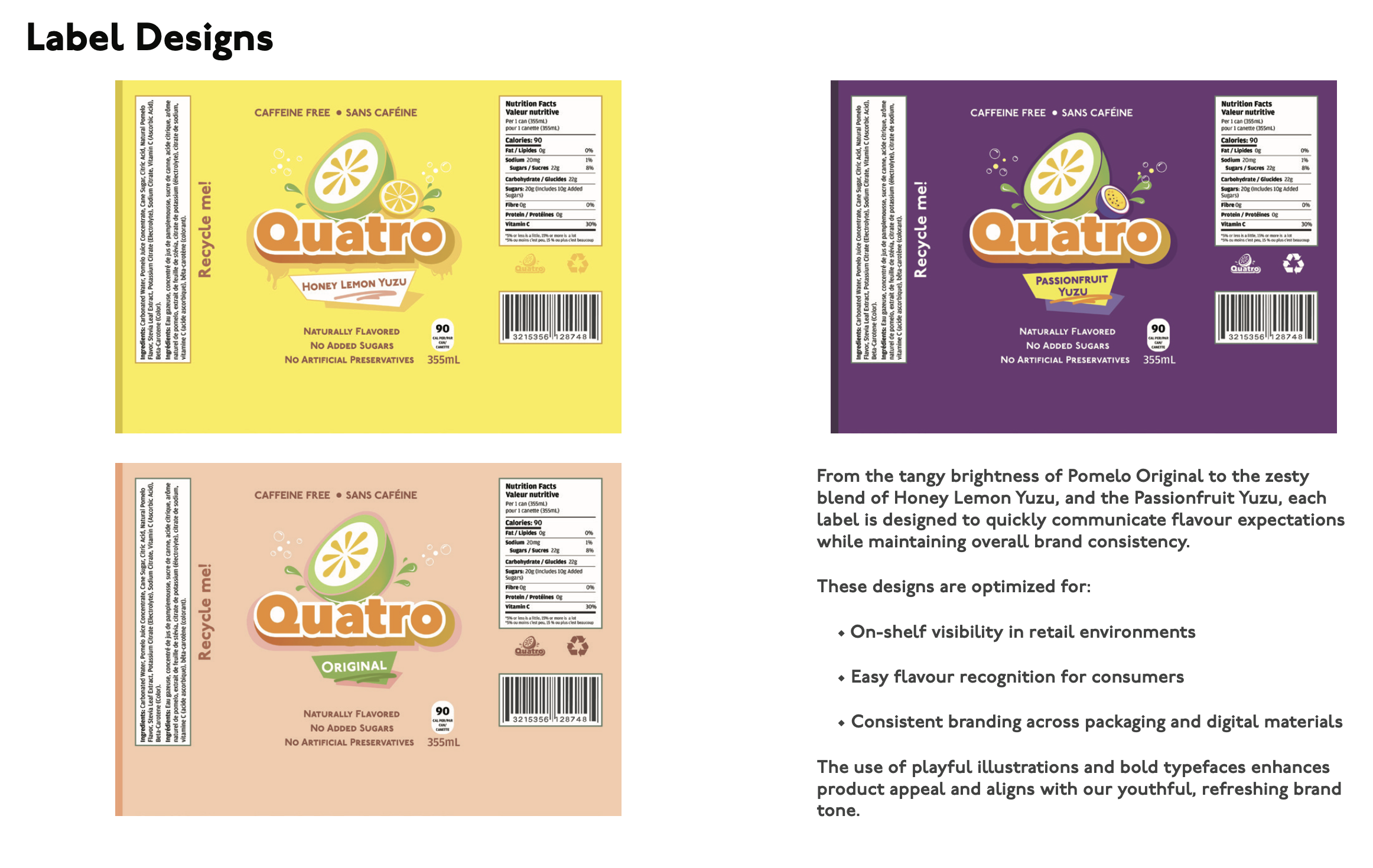
Execution
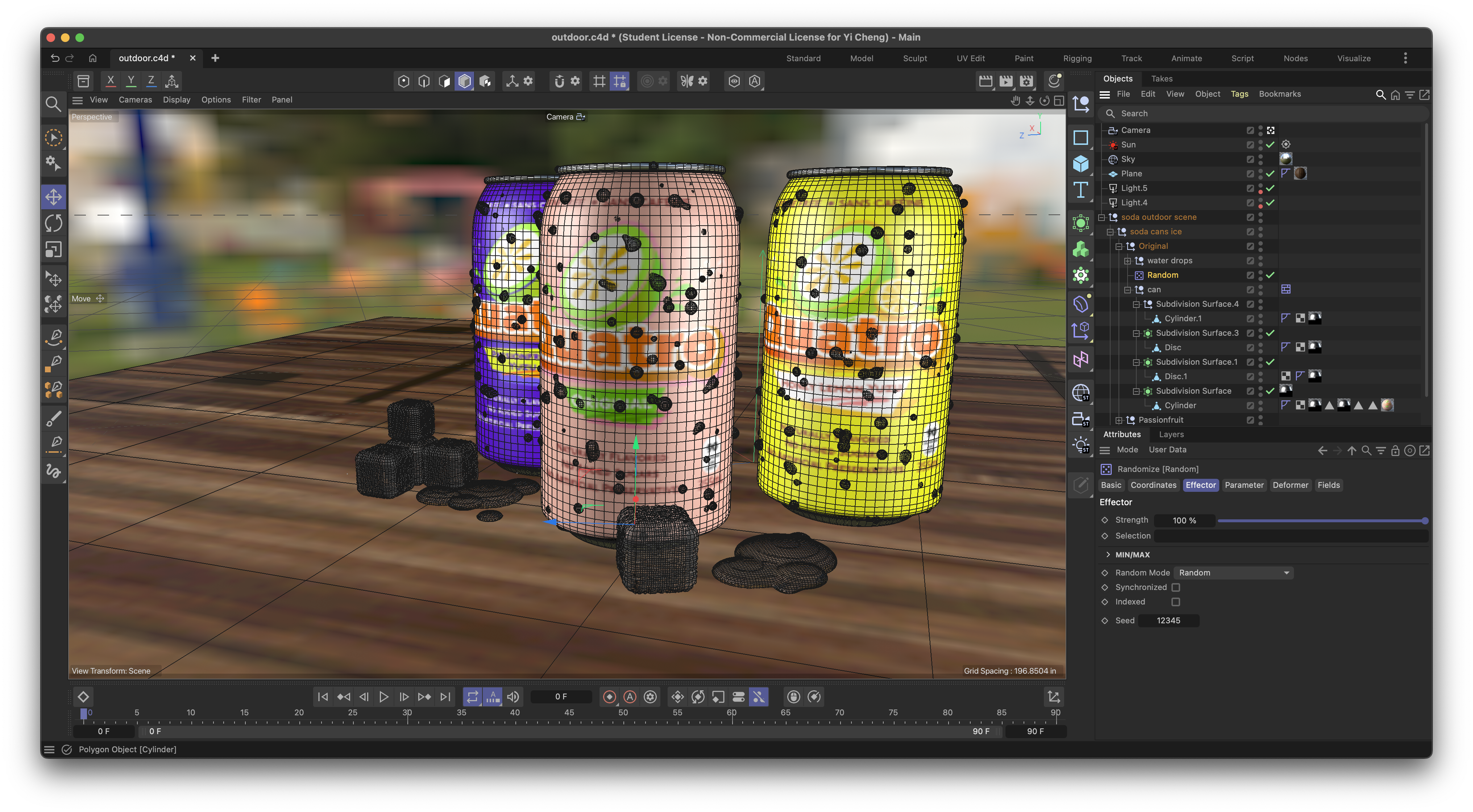
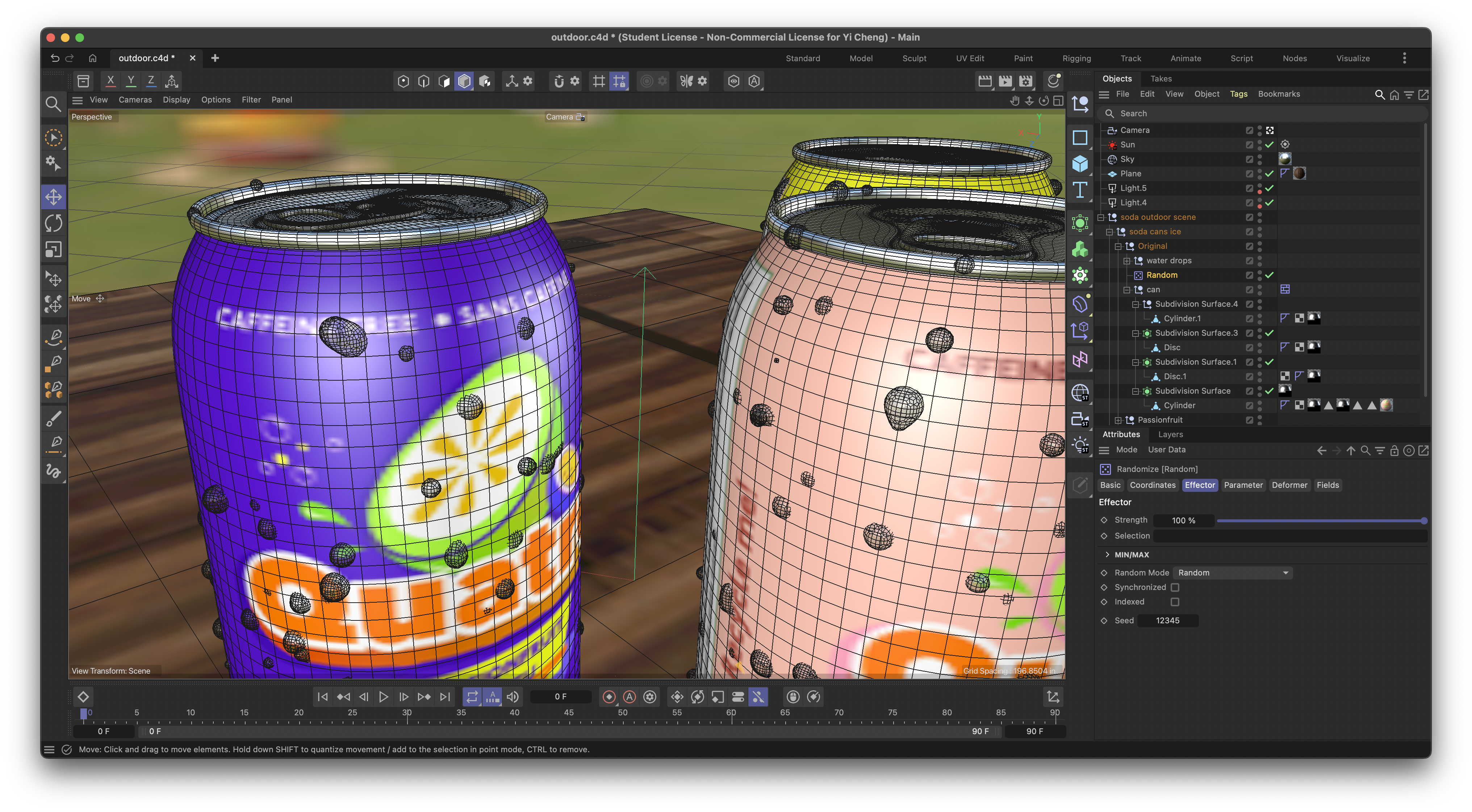
Developed a refreshed visual system using a neon-accented colour palette, retro grid patterns, and a custom-adapted display typeface. The identity was applied across billboard mockups and product packaging in Illustrator and Photoshop to demonstrate real-world viability across scales.
1 / 7